

Brass étagère styled with books, ceramics, and objects against a dark navy wall in a reading room, Yassein Interiors' Grown Up project
A bookshelf is one of the only places in a house where personality is allowed to show plainly. The items on it are not chosen to match the sofa or coordinate with the rug — it's just what you own, on display. This is exactly why most people either overfill it until it looks like storage, or empty it out until it looks like nobody lives there.
Neither is the goal. A well-styled shelf should look like it happened over years, not over an afternoon — even when, in practice, it took exactly one afternoon to get right.
Start With What You Actually Own
The instinct with a bare shelf is to go shopping — stack of coffee table books, a few ceramic vessels, maybe a small plant. That's how you get a shelf that looks like a showroom display instead of your home.
Start instead with what's already yours: the books you've actually read, a piece of pottery from a trip, a framed photo, something inherited. The shopping trip should come after, to fill specific gaps — not before, to fill the whole shelf at once. A shelf built entirely from what you already own will always read as more considered than one built entirely from new purchases, even if the new purchases are beautiful.
Break the Line
The single fastest way to make a bookshelf look unstyled is to leave every book standing upright, spine out, same height, straight across. It reads as a library shelf, not a room detail — flat, uniform, and forgettable.
Break it up. Stack four or five books horizontally and place an object on top. Let one section run vertical, then interrupt it with a low stack. Vary height deliberately, the way you'd vary the silhouette of furniture in a room — nothing at exactly the same level as its neighbour. The eye needs somewhere to land and somewhere to move to next; a straight, even line gives it neither.
Style in Groups of Three
Odd numbers read as arranged; even numbers read as matched pairs, which reads as furniture rather than styling. When you're grouping objects — a small stack of books, a vessel, a piece of art or a frame — group them in threes where you can. Vary the height within the group too: tall, medium, short, not three objects of the same scale lined up side by side.
This is the same instinct behind a well-composed coffee table vignette, just applied vertically instead of horizontally.
Give It Room to Breathe
The opposite mistake is just as common: filling every inch of every shelf because empty space feels like an unfinished job. It isn't. Negative space is what lets the eye rest between groupings, and it's what separates a curated shelf from a cluttered one.
A good rule of thumb: if you can't find at least a little open space on most shelves, you have too much on it. Pull a third of it off, edit down to what you'd actually miss, and start again from there.
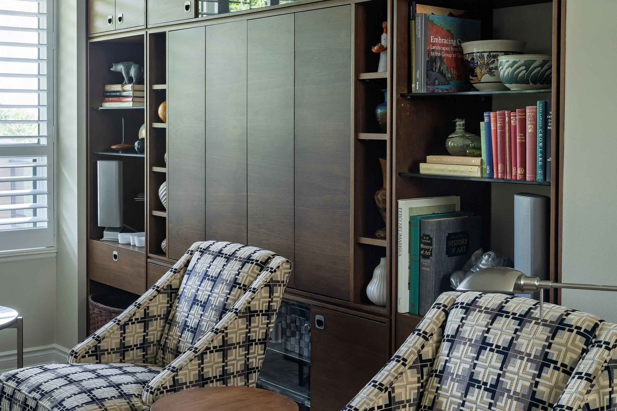
Custom built-in shelving mixing closed cabinetry and open bookshelves styled with books and objects, Kingsway Timeless living room by Yassein Interiors
A Note on Removing Dust Jackets
You'll see this often in styled photography: every book jacket removed, spines replaced with plain cloth covers in a uniform palette. It photographs beautifully. I don't recommend it for a home that's actually lived in.
Beyond the real effort of doing it — and redoing it every time a new book arrives — it strips away the exact thing that makes a shelf feel personal: the cover you remember, the title you can find at a glance. In the family homes I decorate, someone is always pulling a book down to actually read it, not just to look at it. A shelf should work for that person, not just for a photograph. If you want more visual cohesion without losing function, group by colour instead, or corral a few loose or mismatched items into a simple box or tray rather than stripping the books themselves.
Lighting and Backing
Two details most people skip entirely, and both do more work than they get credit for. A picture light mounted above open shelving, or a discreet LED strip along the underside of each shelf, turns a bookshelf into a lit feature rather than a piece of furniture that happens to be nearby. And a painted, wallpapered, or even mirrored back panel behind the shelving adds depth and colour that plain drywall never will — it's often the single change that makes a builder-grade built-in look custom.
The Shelf as Part of the Room
A bookshelf isn't a separate styling exercise from the rest of a room — it's one more surface that should relate to everything else in it. The same restraint that governs a coffee table vignette or a mantel applies here: edit to what matters, vary the height and rhythm, and leave room for the eye to rest. Done well, it becomes one of the truest details in the house — because unlike almost everything else in a room, nobody chose it to impress anyone. They chose it because they wanted it there.
Gaddah Yassein is an interior decorator and the founder of Yassein Interiors, a boutique full-service decorating studio based in Whitby, Ontario. She serves clients across the GTA, Durham Region, and Northumberland County. If you're thinking about a project — condo, house or cottage — we’d love to talk.